No-Code Campaign Management Empowering Marketing Teams
Summary
SkavaSTUDIO is a browser-based, marketing campaign management tool. Part graphics editor, part development environment, SkavaSTUDIO was designed to empower internal marketing teams to execute campaigns crisply without reliance on designers or developers.
SkavaSTUDIO was a developer-led product. It was unfocused, overly complex and it did not meet its goal of putting power in the hands of marketing professionals. Retailers using the application to launch campaigns still tasked teams of developers with coding campaigns.
I developed a research-first approach to Skava’s product development methodology and changed the outcome of the project. As a result, SkavaSTUDIO reached its goal of supporting small teams of tech novices in running campaigns without needing to write a single line of code or coordinate deliverables with designers.
As the lead UX/UI designer, I collaborated with Skava leadership and our domestic and international engineering teams to develop a product roadmap and a large collection of standardized reusable components for SkavaSTUDIO’s library of widgets.
Clients

Process
Mapping The Current Product
Controls in the application were an inch deep and a mile wide. To understand the product, I created a flat map of the content and arranged the screens by sequence. I began to take note of controls or functions that felt disconnected from what was happening in the content area. The functions in turn were later discussed with users in group sessions.
Analyzing the Current UI
One of the stated goals of the project was to make a WYSWIG experience. I analyzed the UI to understand each function and potentially identify edge cases or states.
Competitive Research + Establish Benchmarks
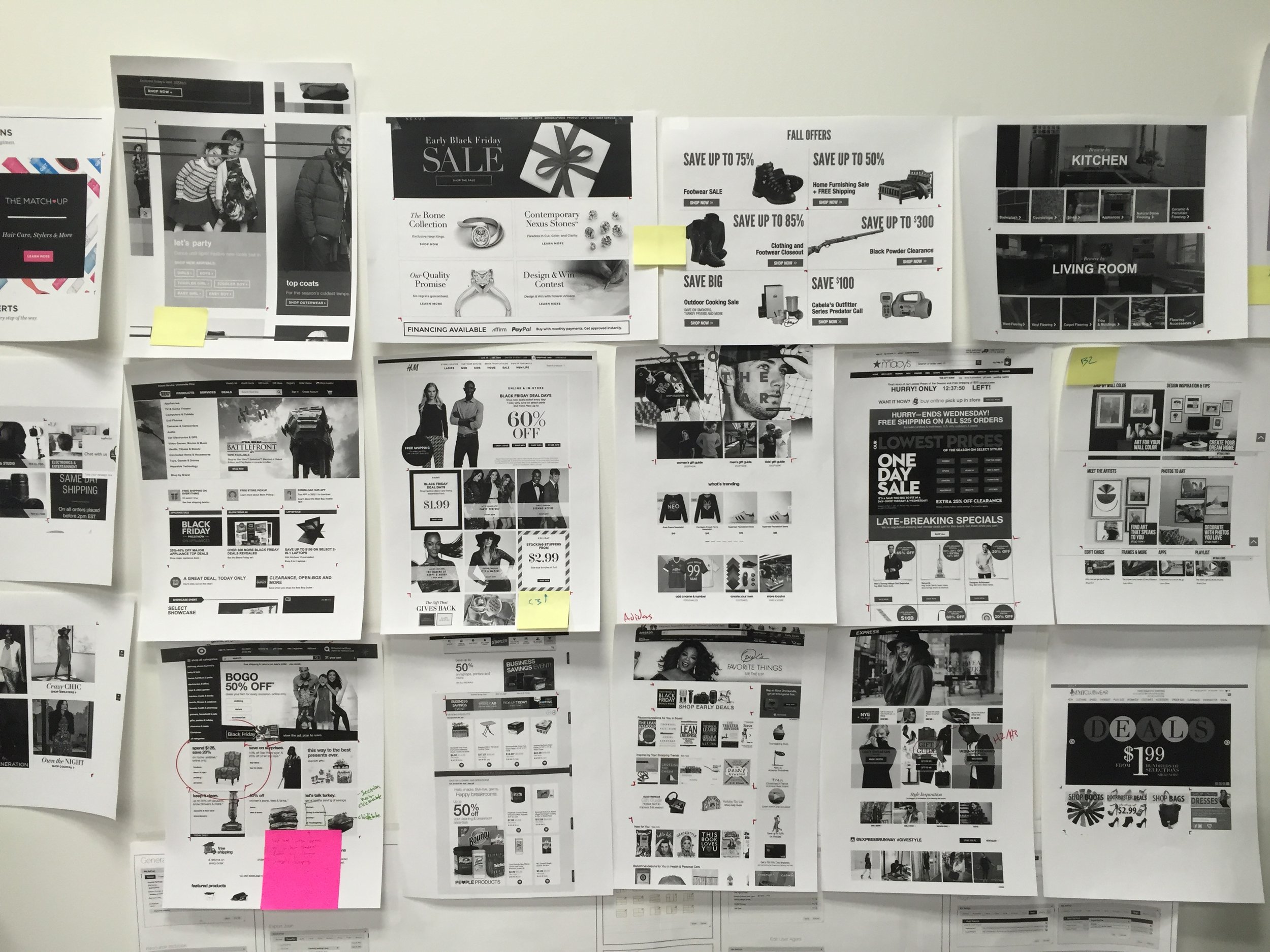
To understand the market, I researched and found the top 50 site builders. Then, I developed a simple repeatable test to identify common patterns and interactions users experience when using similar products.
Testing the platforms:
Open a new document;
Create and place a background [container];
Add and place an image within the container:
Question: Are images placed using drag and drop features or using a file picker?
Question: Are there limits to image types? (i.e., jpg, png allowed, tiff not allowed)
Question: Does the application introduce artifacts? (i.e., down-res)
Question: Does the application apply local rules to image sizing?;
Add text - 1 label using a loosely defined H3/H4 size and, 3 to 4 lines of descriptive text using body/copy size; and
Add a call to action.
Competitive Research: Platforms Ranked
The systems were ranked in a spreadsheet. Green identified applications that surpassed expectation, grey identified applications that met expectation, yellow signified applications that were outside of the scope of the test, and white rows were applications that were disqualified.
Widget Research
Persona Creation
Personas were created as a design discussion level tool. The goal was to place non-coders centrally as our core user group. The project was once led by developers and as a result, there was a tendency to make features technically rigorous.
Insights & Solution
Marketing teams benefited from the lowered barrier, but launching a campaign was still dependent on developer effort. The product was a long way from being considered no-code. I analyzed for emerging patterns and commonly identified issues.
The top takeaways were;
Marketers frequently have to coordinate deliverables and schedules between designers and developers. Making SkavaSTUDIO a true no-code solution could eliminate dependencies and significantly reduce timelines and costs.
Widget creation is the function marketers use most often. It is also the function that is most frustrating for users.
Introducing a living library of white-label widgets based on common patterns would meet customer demand and increase usage.
Prioritizing Features
Feature dump session with stakeholders and New York office engineers
Features were prioritized across several sessions with several teams. We agreed on a short list of features that would deliver the most impact for users. The features were considered essential and low effort:
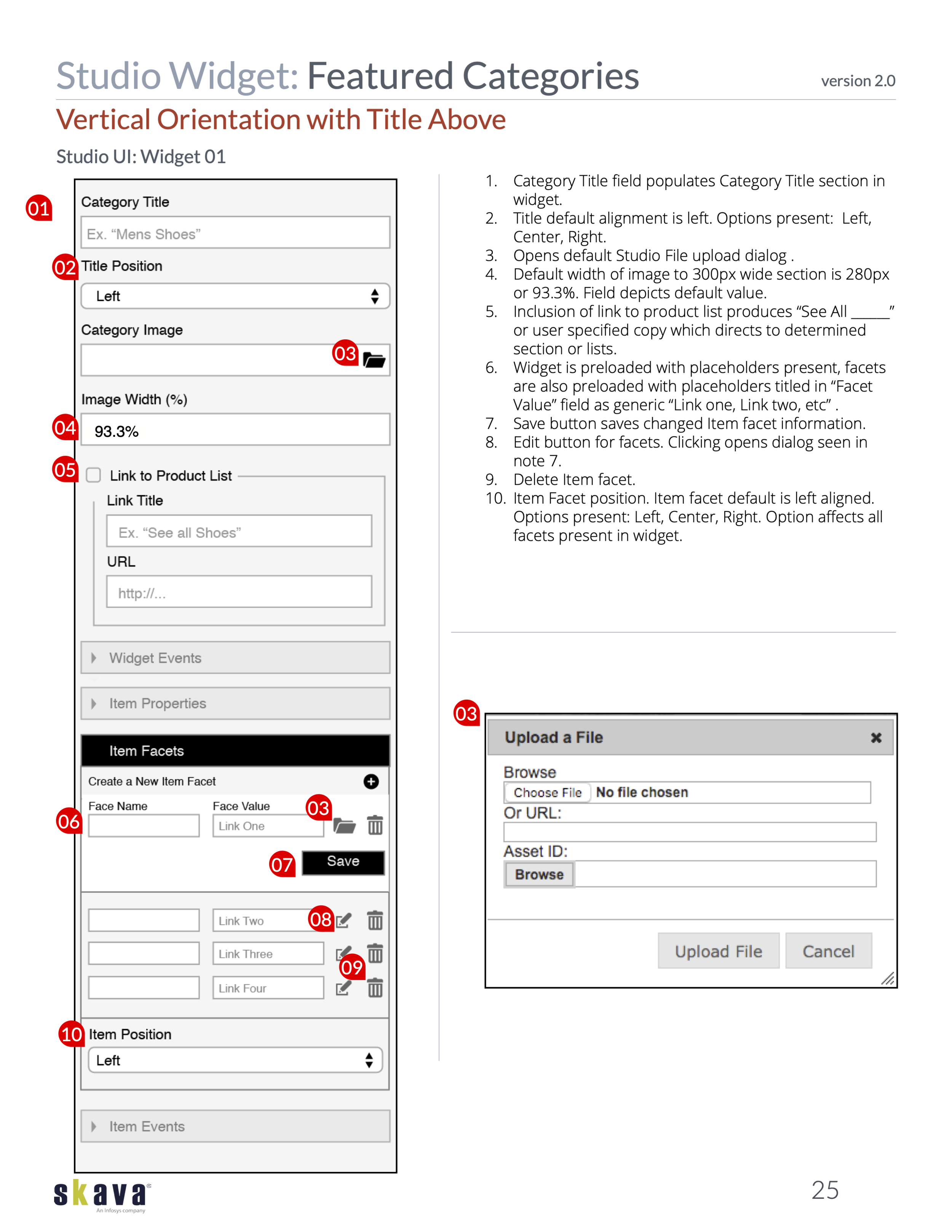
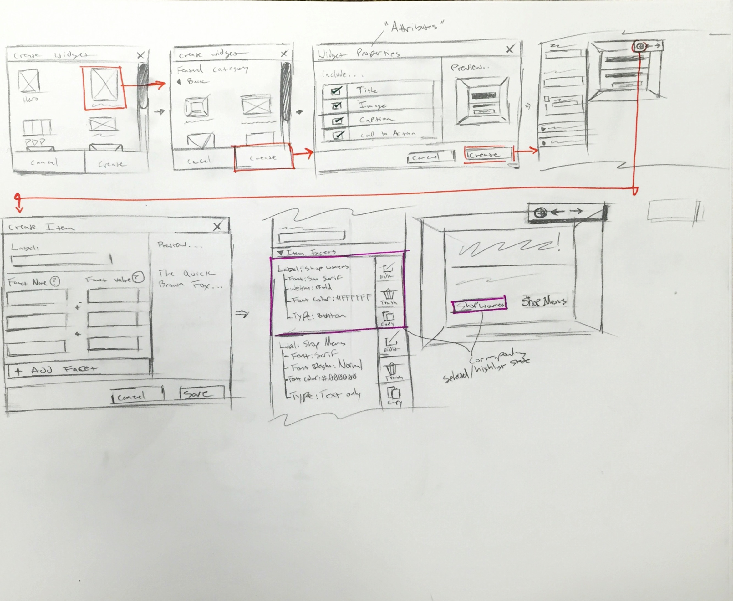
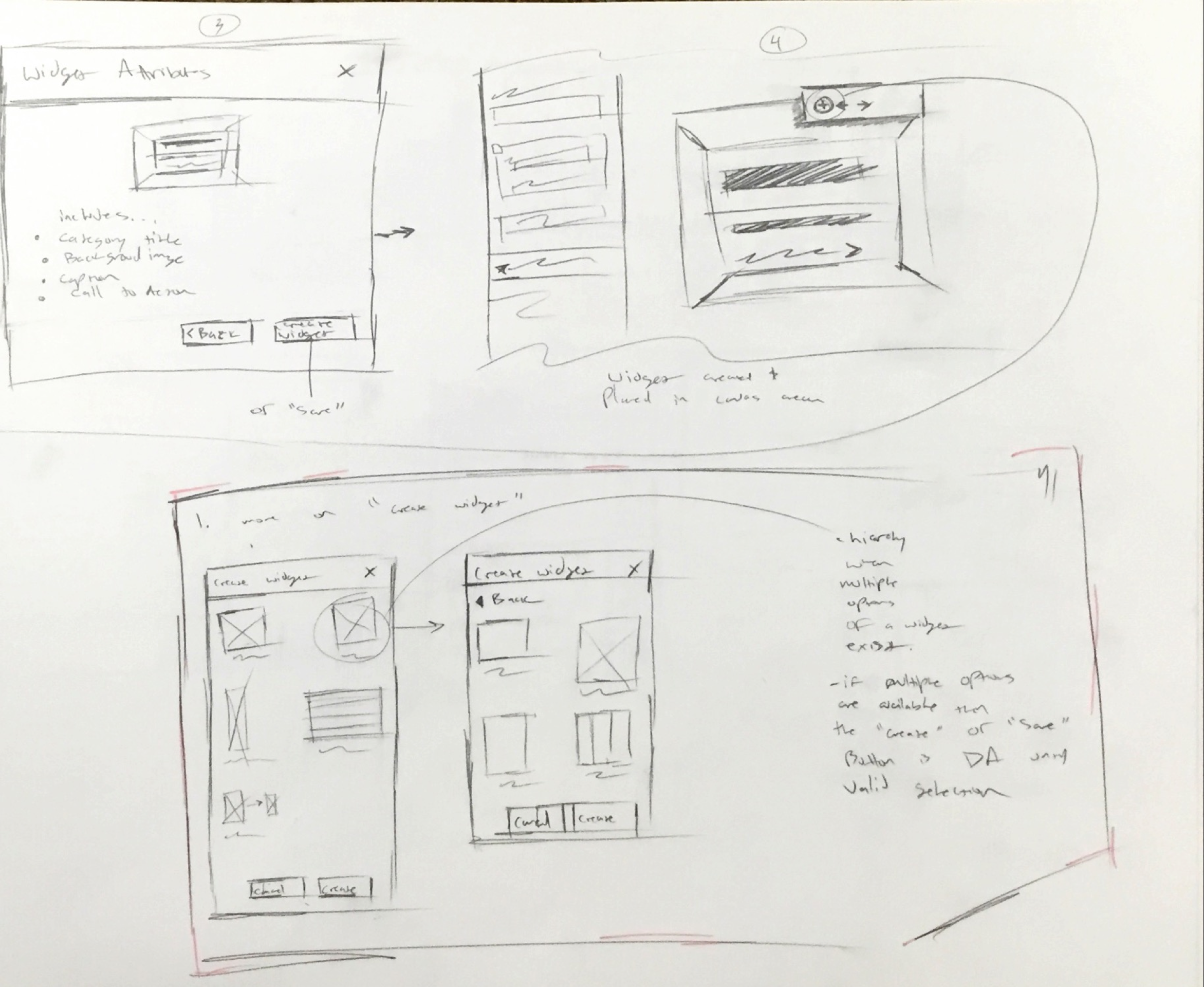
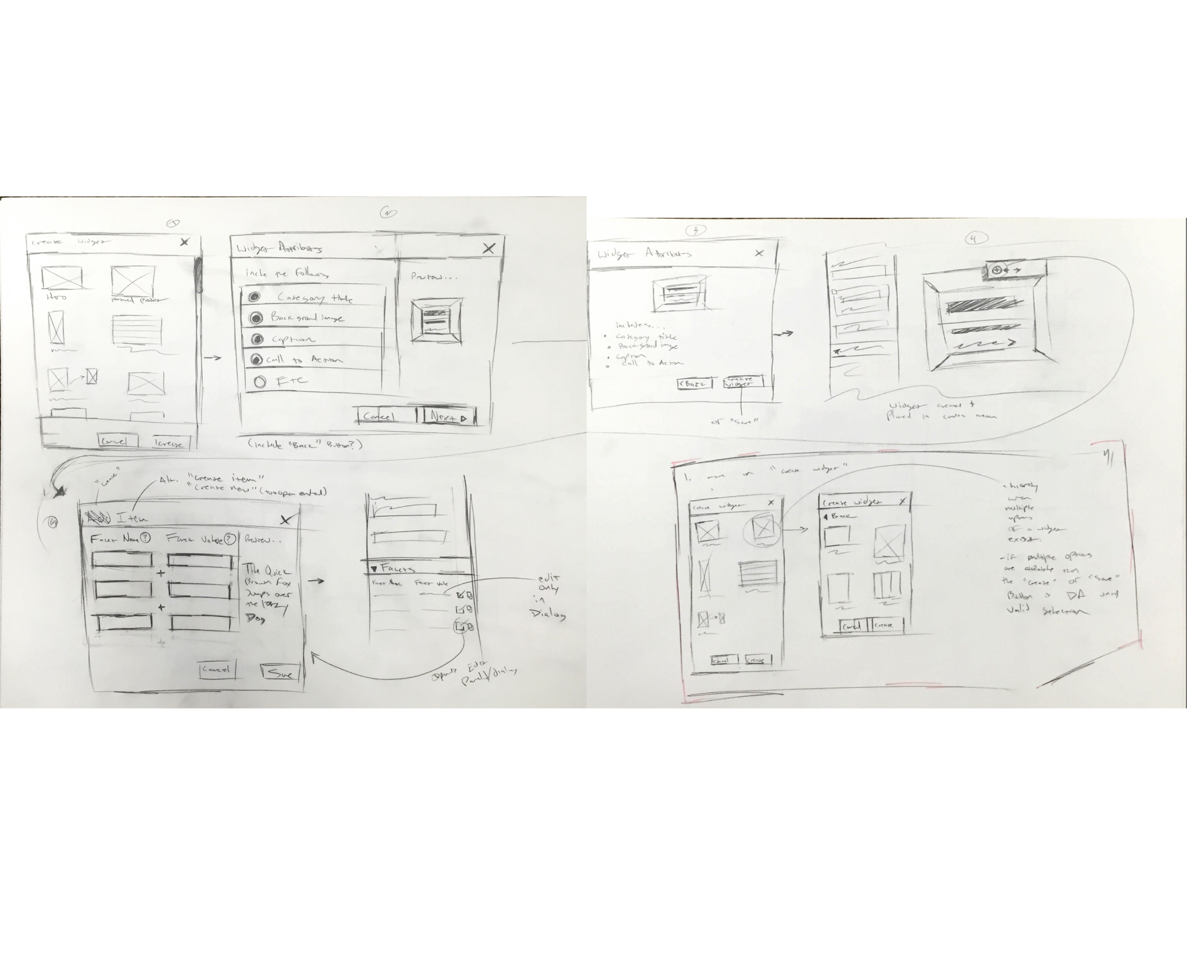
Simplified Widget Creation - lowering the bar for widget creation would ease a load of frustration for users who were used to working with a confusing and unintuitive interface.
Revised Hierarchy in Widget Creation Controls - The order of controls in the widget creation process often created confusion. Veteran users were often slowed down by being afraid to make the wrong, often irreversible choice.
Standardized White Label Widgets - Offering users a library of standard components based on popular and common retail site components offered a strong value proposition. We offered users an opportunity to spend less time creating components from scratch, so more time could be spent managing active campaigns.
Streamlining the Widget Creation Process
I streamlined the widget creation process to be in line with the easier examples I observed during benchmarking. Users should be able to create widgets quickly while using the provided controls at the top levels in the interface instead of having to navigate endless nested menus for simple adjustments.
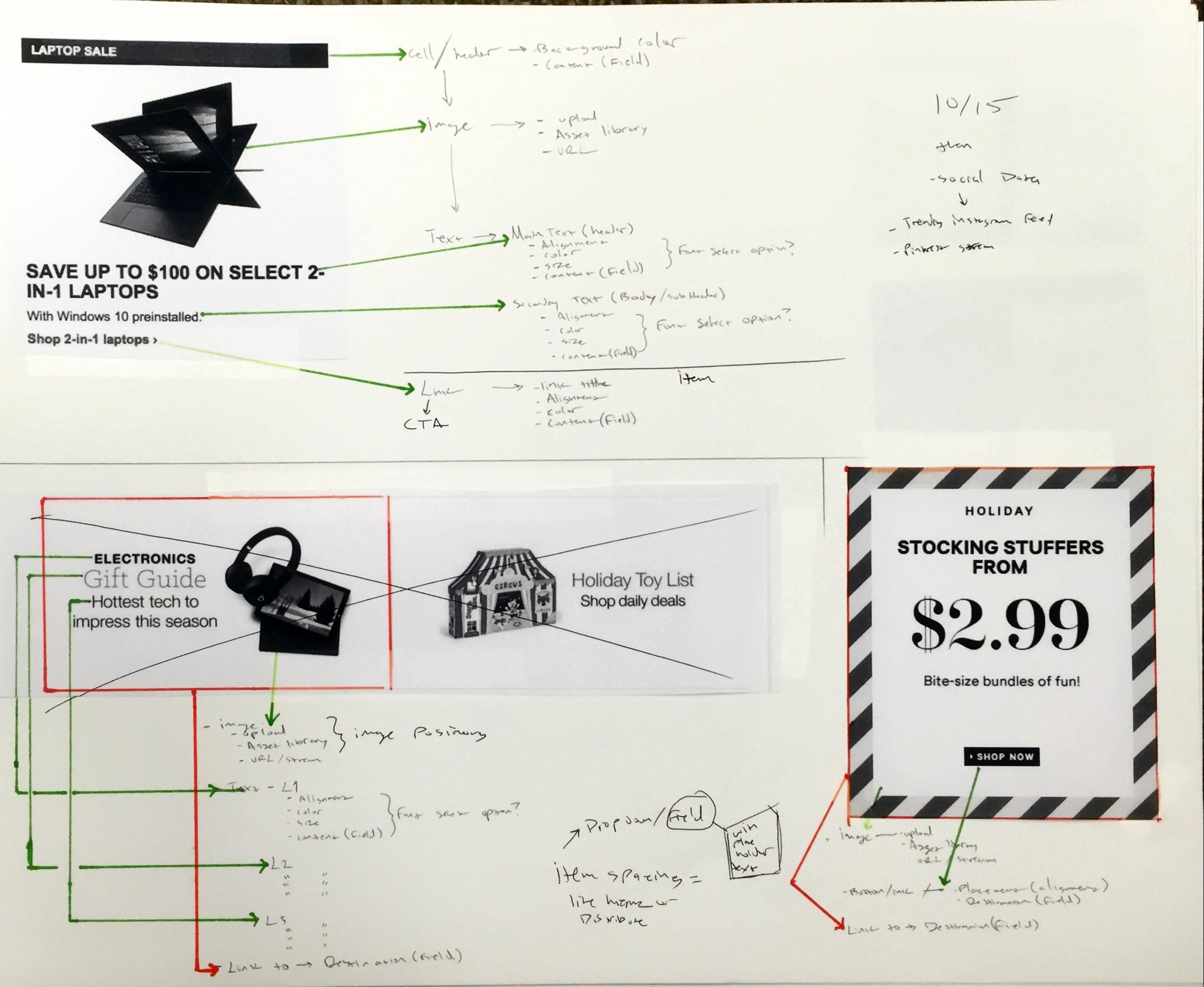
Getting Granular
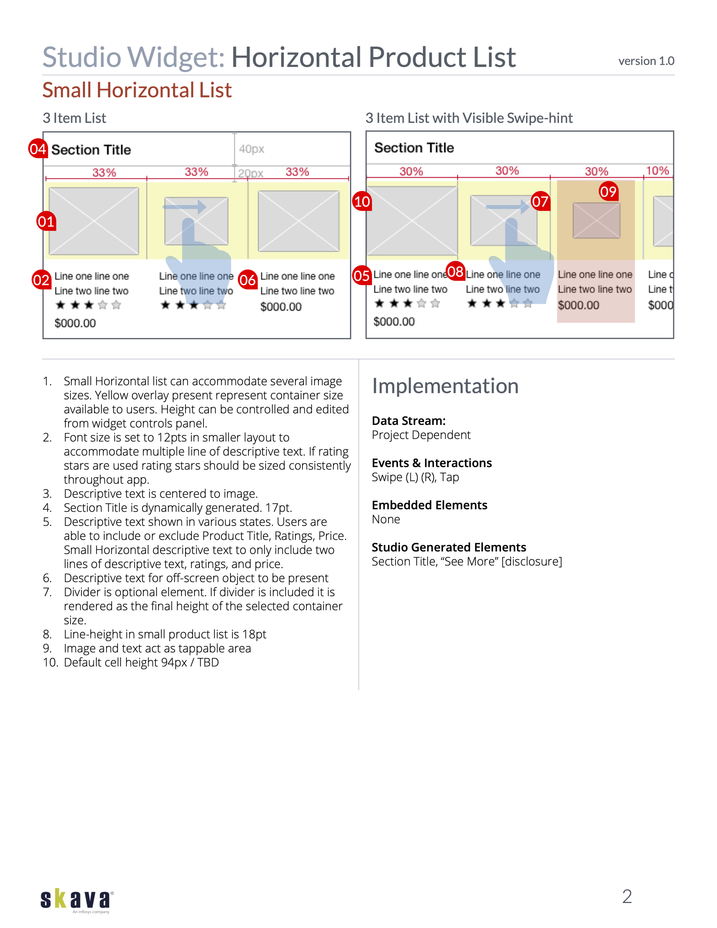
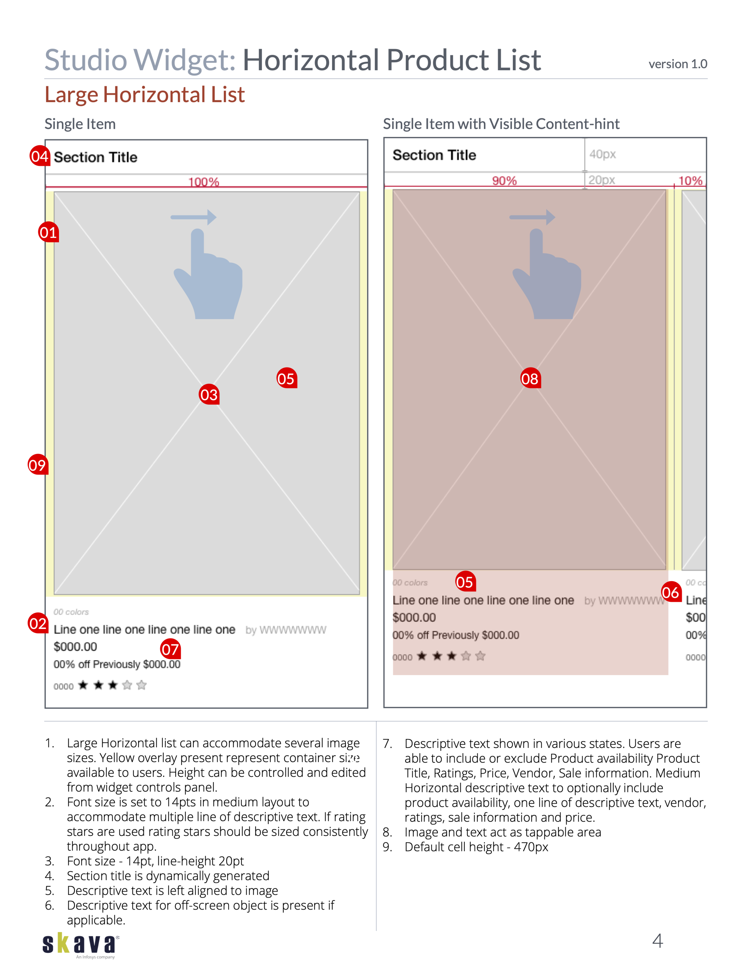
I began reducing components down to atomic level elements, which were then mapped to interface controls.
Deliverables