Success Measured One Year at a Time

Summary

Individual Partner Plan (IPP) was a complex, long-term project that needed problems addressed in immediate and long-term realms. I helped reduce late submissions by 78%, reduce help desk requests by 92%, and, reduce needed training hours by 86%. This was achieved by cross-functional collaboration operating in a users-first framework, reducing the number of steps in forms, using clearer labeling, and introducing a quieter, work-focused UI.
A substantial impact was made in areas of project timelines and cost reduction. This was made possible by the creation of a design system, a component library, and, a method to dynamically generate forms using design system elements from the component library.
IPP is a Performance Review Tool
IPP is used by partners to check past year projected performance against actual outcomes and enter anticipated activity for the upcoming year.
Strategy Alignment
Market strategy changes year to year, IPP is used to align partner priorities.
Steering the Ship
IPP is direct feedback between anticipated billable activity and year-end earnings report. Results from captured responses are used as navigational landmarks by the steering and strategy committees.
Why Is No One Using it?
The application was redesigned year over year. I was tasked with understanding why submissions were frequently late and why users held a low opinion of the product.
My Process
Jumping Into the Deep End
I flew to several offices and held product workshops with partners and legal assistants. When possible, I held shadowing sessions with legal assistants to observe how they solved problems in real-time.
Targeting Success Metrics
I read through old help desk tickets to find long-standing issues or recurring patterns.

I wanted to know about the history of the product and if it would be possible to formulate an approach based on historic frustrations.
I developed a relationship with the Knowledge Management department because they were the department responsible for developing training curriculum. Partners and legal assistants were unhappy with attending mandatory training year over year.

Late submissions was a large problem for the Policy Committee and Financial teams. It was impossible to project future performance with confidence.

UI Analysis
Sample image of annotated print out of IPP. This was a first pass of problematic areas which were cross referenced with users for validation of assumed areas of difficulty.
Old versions of the application were reviewed. The most recent version at the time was used as a point of reference. I analyzed the UI for usability issues. I noticed there was a tendency to introduce competing signals. Pages were jam packed with information and users were frequently contacting User Support to ask easy questions answered.
Identified Problems
I identified several areas that made it difficult for partners to complete plan in a pain free manner.
The task was daunting. Partners are strapped for time, and the form can take anywhere from 4 to 12 hours to complete.
Users did not trust the system. The application did not autosave work and sessions timed out after 8 hours without alerting users of a session ending. Most partners completed the process between tasks at work which could mean switching between tabs and losing track of the open task at hand. Losing hours of work was a common occurrence and almost seen as a badge of honor.
Content Overload. Partners were under the impression that an overload of information was the sure way to a positive review. Policy members tasked with reading through partner responses found the process of combing through mountains of content for relevant information unpleasant. The UI itself was also a wall of content.
Immediate Solutions
Refining the Flow, Shaping Content
IPP section by section flow.
I proposed eliminating open ended text responses in favor of limited choices + character limited text boxes. The other change was sequencing data in order of relevance. The result would be stronger financial and strategic information being reported out and making it so partners are thinking less and focusing on the task of completing the form.
Work Focused UI
Approaches compared. 2016 was the first year I designed IPP.
Addressing pain points at the granular level.
Short-Term Outcomes
Evolution of IPP through the years. Dynamic Forms, RGB and The Lab were used to create IPP 2020.
Results of the changes were apparent immediately. Late responses and Help Desk calls were down to fraction from previous years. Training hours logged were also impacted by addressing usability issues.

Help Desk tickets statistics discovered in IT Tracking database. Created in collaboration with User Support.

Late submission statistics pulled from usage logs. Created in collaboration with Information Services.

Training Hour statistics created collaboratively with Knowledge Management.
The Long View: Addressing Deeper Core Issues
The old flow and timeline of IPP. Development typically began in May with a planned deployment in September.
When the project was reopened for the new year, I wanted to approach deeper issues with the application.
Groundhogs Day
IPP was tied to several recurring costs. The application had to be budgeted for, rewritten, and re-deployed because there was no framework to allow for last-minute changes. The questions were hardcoded and they changed each year to match the established strategy of the upcoming year. Waiting for last-minute changes impacted other projects and developer momentum.
Development Cost
Internal development projects can easily run above $120-220k. This was a cost that could be reduced with proper tooling.
Reinventing the Wheel
IPP changed wildly from year to year. Units, colors, and, styles were used without a sense of established standards. The difference in styles and UI patterns used was a direct cause of training costs, Help Desk tickets, and unchanging development timelines.
Long View Solutions:
RGB

Parallel to IPP, RGB was developed to standardize components - it was an internally design system developed to shorten design and development work. It is a living system that is based on Bootstrap with some consideration towards customized SharePoint solutions.
RGB was created using atomic principles
The Lab
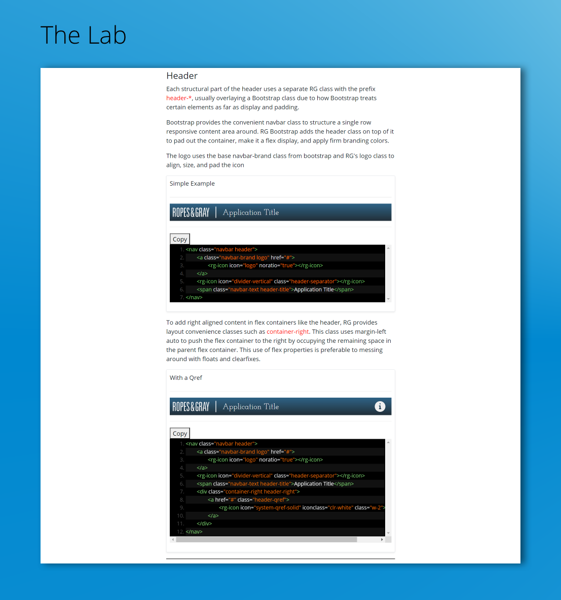
Example: sample section from The Lab
The Lab was a companion tool that bridged design and development. It is a repository of RGB based components. Changes introduced at the lab level affect all instances of the component or element used elsewhere.
Dynamic Forms
The page in parts; colored areas signify dynamic containers
Input area from sample page in IPP, elements grouped in input area. Shown; Display, Padding Rules for elements and Error States for elements.
Dynamic Forms is the final piece in our solution. It reduces project timelines and costs related to annual overhauls or waiting for last-minute changes.
Pages were approached as a flexible collection of elements that can be assembled to meet the needs of the project as they change.
RGB elements were refined to operate in a swappable manner while maintaining global styles and consistent padding and placement rules.
Impact: Money Saved, Time Saved
Development timeline reduced to 30% of previous years;
Development costs reduced 80%;
IPP shares similar and predictable UI with other internally developed tools;
Partners and support side employees no longer need to be retrained each year;
Legal and Business side departments operate with clearer common goals in mind;
Easier decision making for Policy Committee members